BASECAMP ORANGE
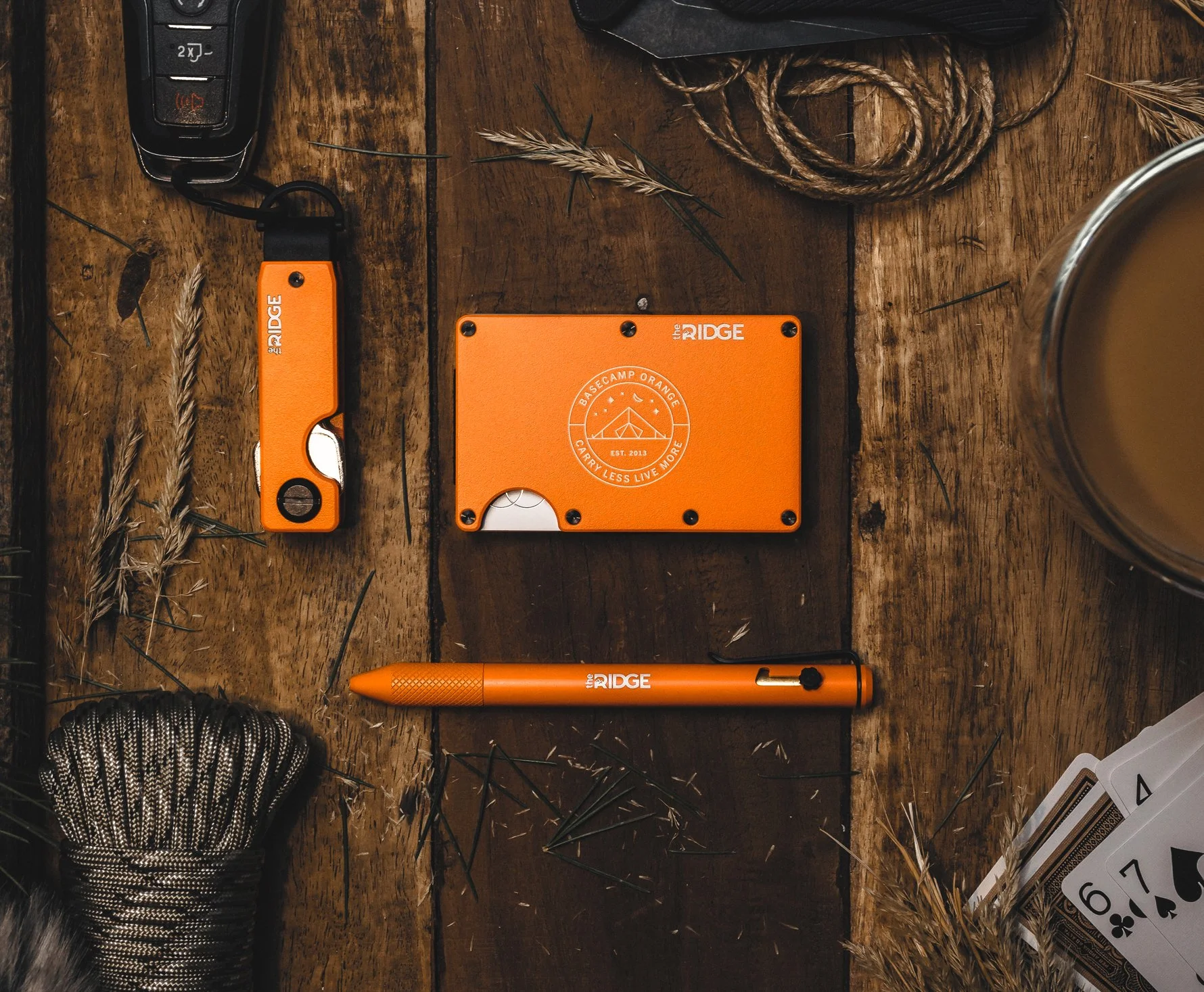
Our latest product launch at Ridge introduced an exciting addition to our wallet collection: the Basecamp Orange color variant. This innovative concept was intricately linked to the notions of a secure home base, outdoor safety, and the infusion of vibrant and lively hues to harmoniously encapsulate the overarching theme and aesthetic we aimed to convey.
To elevate the campaign's visual impact, we implemented a strategic incorporation of props and meticulously executed flat lay photography. The deliberate choice to employ these elements proved to be highly effective in enhancing the overall narrative and message we sought to communicate.
Below, you will find a selection of static advertisements that I personally crafted for the launch, each meticulously designed to align with the campaign's overarching objectives and aesthetic vision.


